March 06, 2023 | 2 min read
Minimize Cognitive Load in UX

Gopakumar TV
Director – UX & Creatives

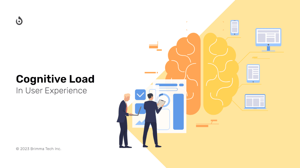
How easily users are able to find content and complete tasks on your application is influenced by the total cognitive load required, which refers to the amount of mental processing power needed.
Just as computers have limited processing power, the human brain also has a finite amount of cognitive capacity. When we encounter an overwhelming amount of information, our ability to process it efficiently can be compromised, leading to errors, missed details, and frustration. The concept of cognitive load, which measures the mental effort required to operate a system or interface, is therefore crucial in designing user experiences that are intuitive and easy to use.
While cognitive load was originally introduced by psychologists to describe the effort required to learn new information, it also applies to activities like web browsing. Users must not only learn how to navigate a website but also retain relevant information in working memory. For example, when planning a vacation, users must keep in mind not only the website's layout and functionality but also their budget, travel dates, and other specific constraints.
Unlike computers, our brains cannot be upgraded to handle more cognitive load. Instead, designers must work within the limitations of human processing power to create user experiences that are intuitive and require minimal cognitive effort. By reducing cognitive load, designers can improve user engagement and satisfaction, ultimately leading to more successful products and services.
How to Reduce the Cognitive Load in your design.
- To prevent impairing usability, it is important to steer clear of visual clutter such as irrelevant images, redundant calls to action, and meaningless typography flourishes that can slow down users. However, it is worth noting that design elements such as meaningful links, images, and typography can be valuable, as long as they are not overused.
- By utilizing labels and layouts that users have encountered on other applications and websites, you can tap into their existing mental models about how apps and websites work, thereby reducing the amount of learning required to use your site. This can improve user engagement and make your site more intuitive and easy to navigate.
- Scan your design for any elements that necessitate users to read text, recall information, or make a decision. Next, explore alternative solutions: is it possible to display an image, present previously entered information, or utilize a smart default? Although it may not be feasible to shift all tasks away from users, reducing their workload in this way frees up more mental resources for crucial decisions. By eliminating unnecessary tasks, you can enhance user experience and improve usability.


